Retail Interiors l 2019-2020

Desigual

Desigual's effort in rebranding its edge in retail saw new store concepts created together with Kingsmen. In 2019 - 2020, we developed several retail store revamp for Desigual in order to illuminate its new brand vision to inspire creativity

to inspire

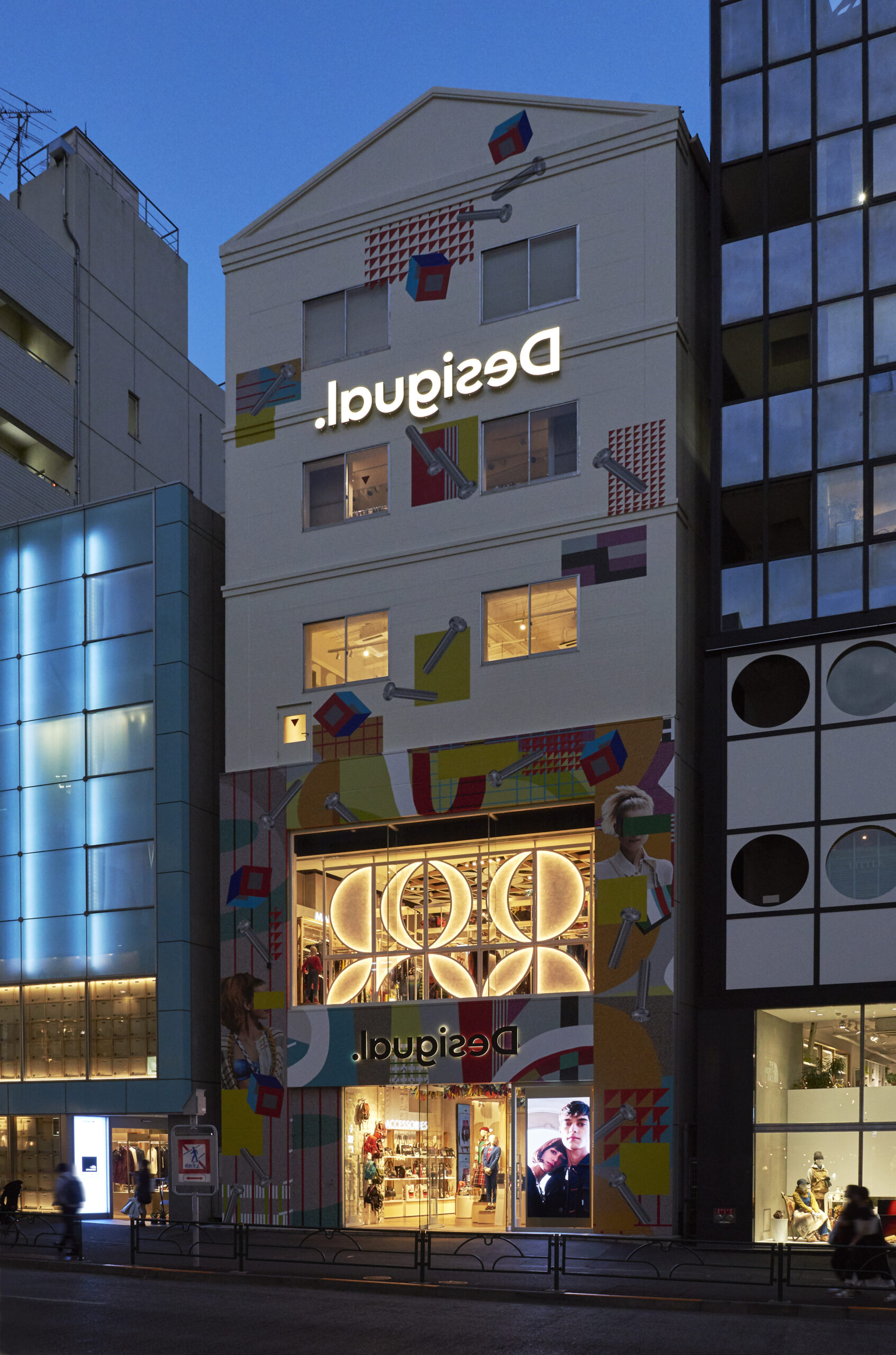
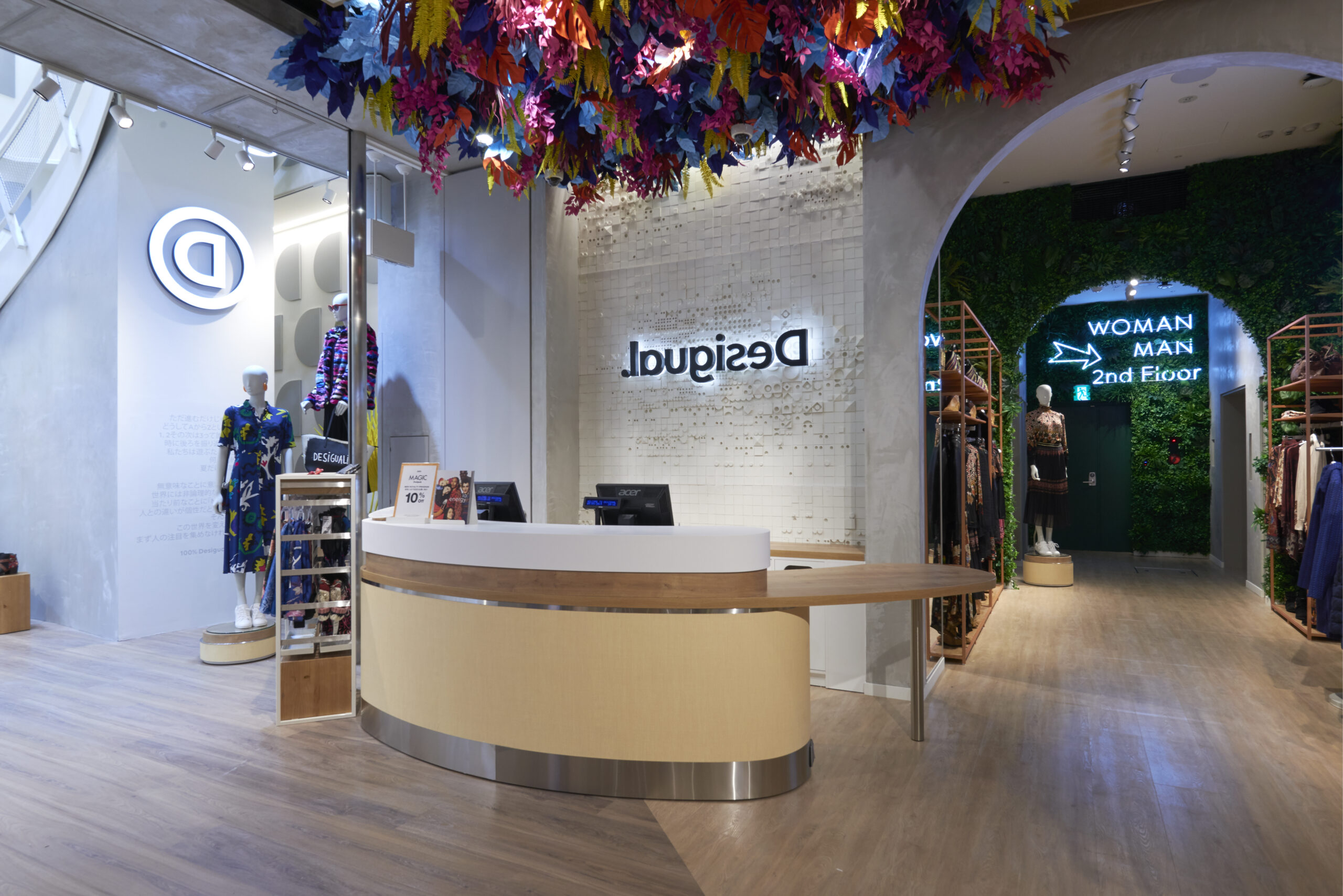
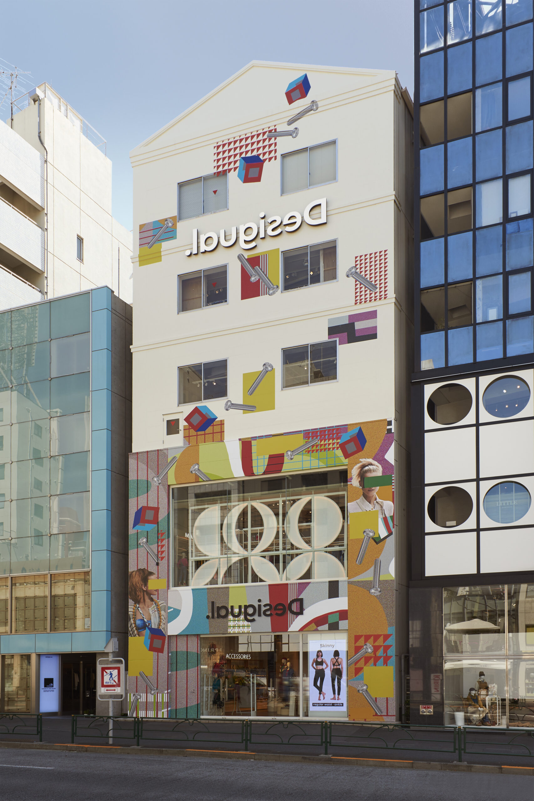
Eye-catching standalone stores are ideal sites for brands to capture shoppers and passer-bys’ attention. In Harajuku Japan, the three-story Desigual feeds fresh flavours to the brand’s style.

A vision created with artist Ran Tondabayashi combines to bring a brillant palette and brand image.

to activate

The poppy themed store concept is layered with decorative petal panels throughout the walls. Beyond aesthetic, the three-story space also leveraged on workshop spaces and customisation corner, keeping design layout expansive for interactive retail possibilties.

to engage

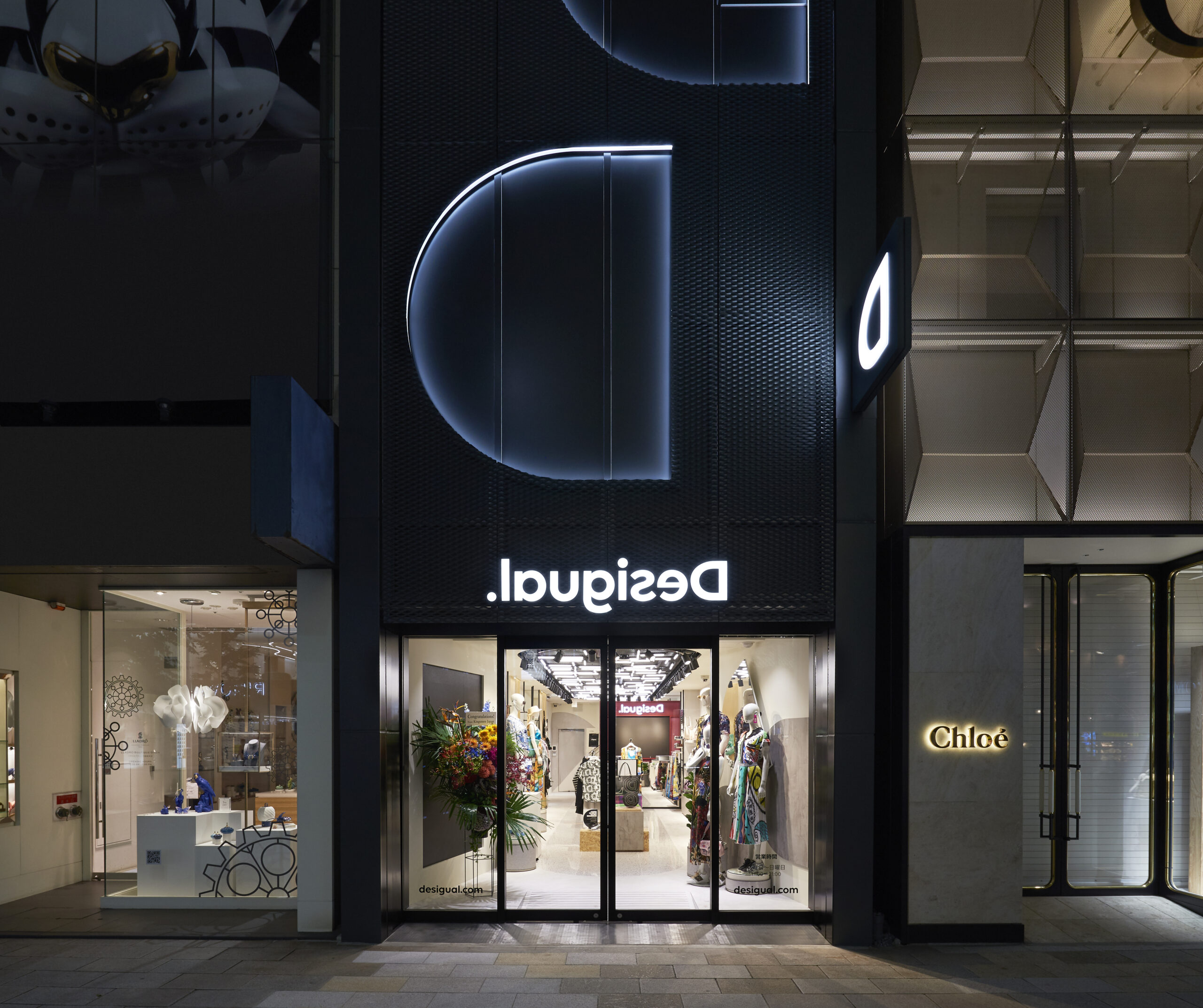
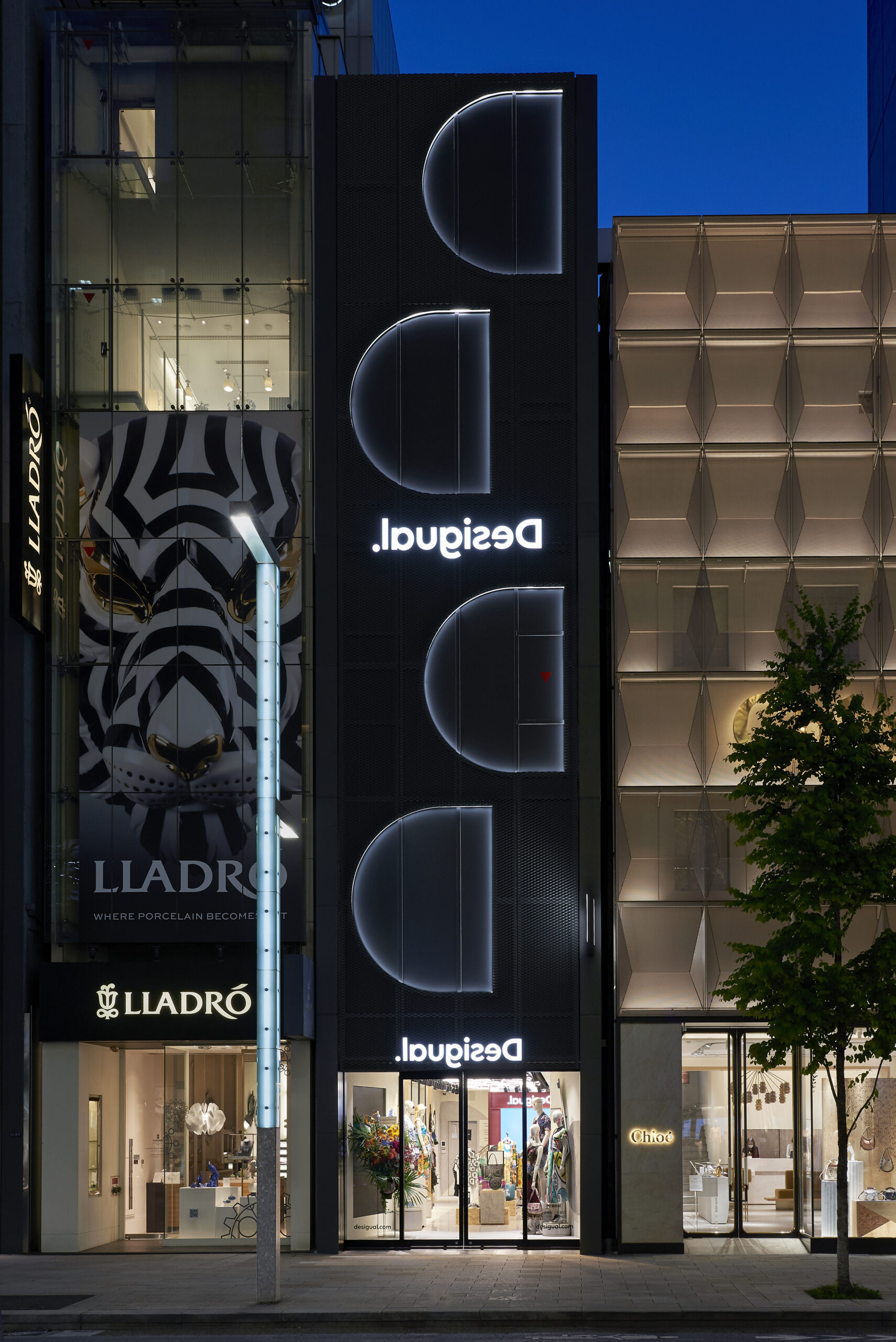
While the Harajuku store emulates a vibrant and youthful atmosphere, its counterpart at Ginza district of Tokyo represents an edgier, urban design.
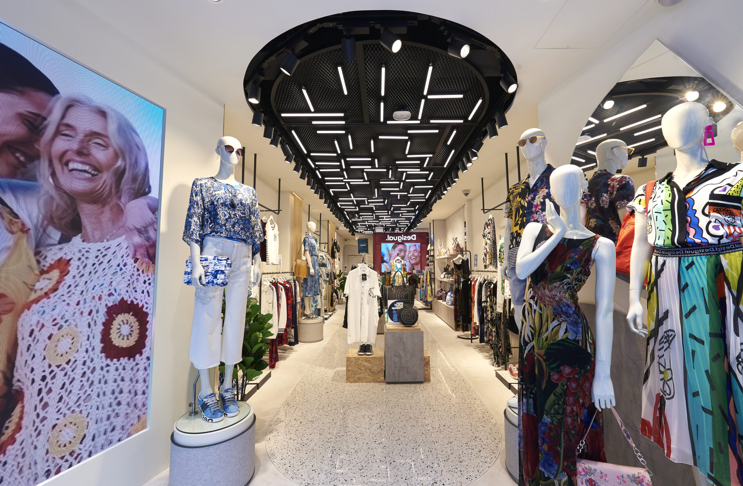
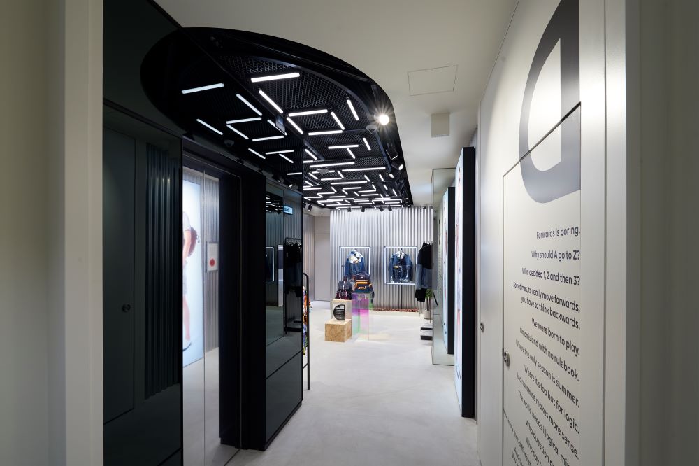
Also a three-story boutique, the facade is clad in sleek black, illuminated by the reversed ‘D’ lettering of Desigual rebrand icon. In its interiors, LED rods line the ceiling in zig-zag pattern and black mesh. Mimicking an urban factory, this similar design was later implemented in Desigual at Changi, Jewel Singapore.

key services

spatial build

project & design management

related news

Keep reading about Desigual's rebranding efforts.

find out how we can create endless possibilities together

Begin the experience